Turning raw data into actionable marketing decisions
GA4 Dashboard for TastyLab
- GA4
- Reporting
- Funnel optimization
- Insights
🏪 Client Context
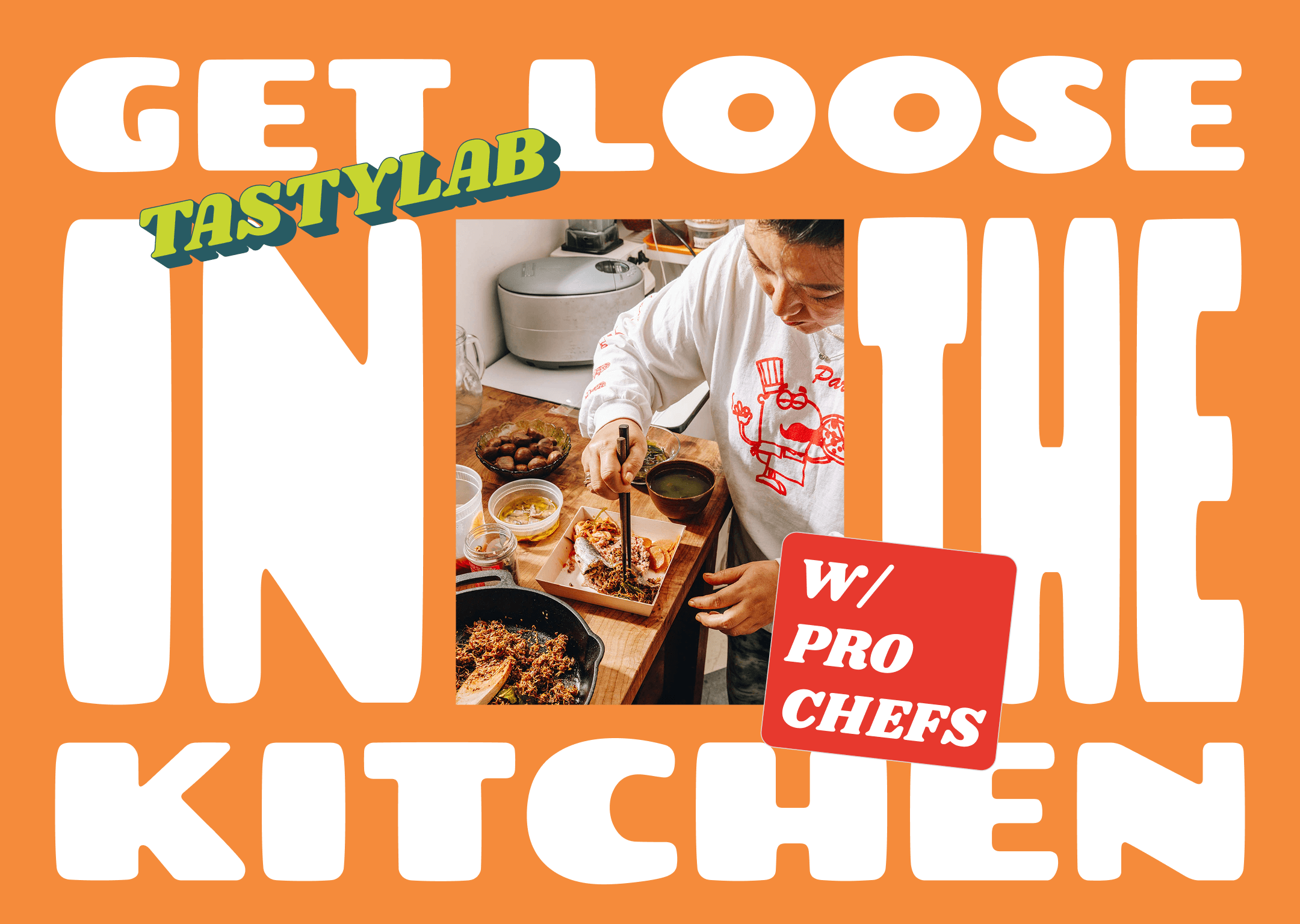
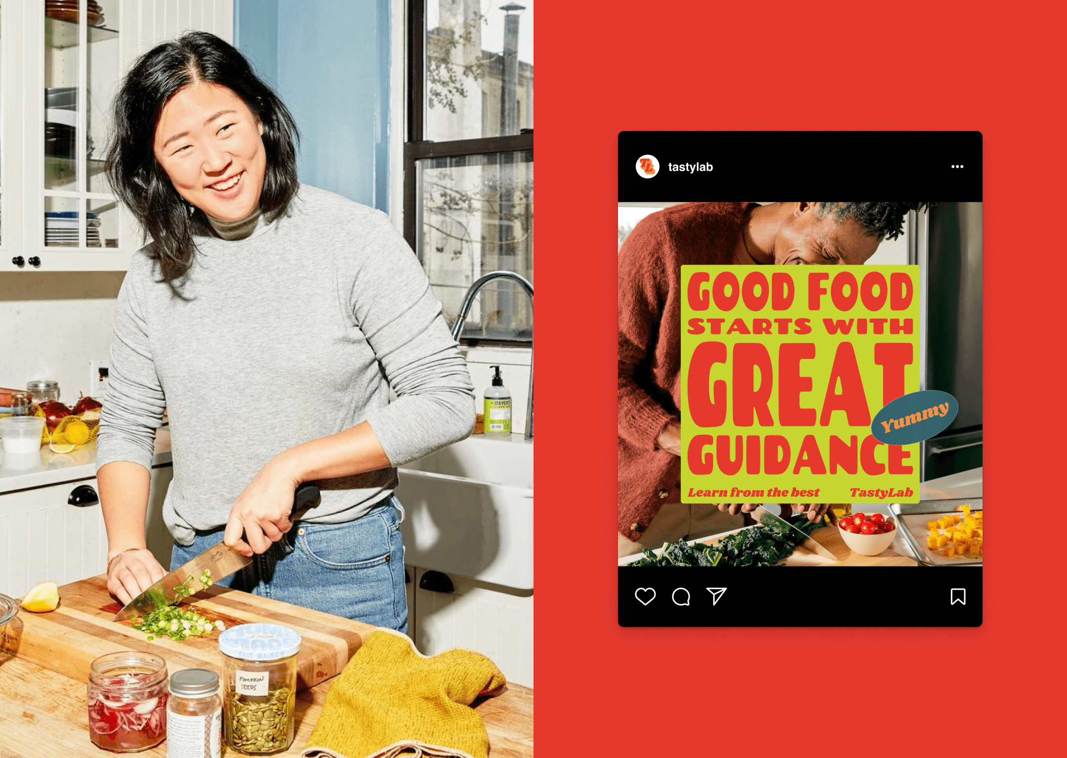
TastyLab is an online cooking class platform offering live and on-demand sessions with professional chefs. It serves a mix of home cooks, food enthusiasts, and aspiring professionals.
The platform runs digital campaigns across social ads, Google Search, and email newsletters but struggled to understand:
- Which channels drove the highest-quality traffic
- Where in the sign-up funnel users dropped off
- Schedule: 4-week summer promo window
This is a fictional project developed to demonstrate my ability to design a GA4 dashboard, interpret data, and translate insights into strategic marketing recommendations.

🔍 The Opportunity
TastyLab’s marketing team had plenty of campaign data, but no centralized dashboard to connect traffic, engagement, and conversions.
This meant missed opportunities to:
- Identify low-performing pages
- Reallocate ad spend more effectively
- Improve mobile experience for learners
🎯 The opportunity? Build a custom GA4 dashboard with a connected Insights Report to reveal where to optimize the funnel and boost sign-ups.
🛠️ Tools & Platforms Used
- Google Analytics 4 – dashboard creation, funnel tracking
- Google Tag Manager – event setup & conversion triggers
- Google Sheets – KPI overview sheet & modeled data
- Figma – dashboard mockups for presentation
- Looker Studio – insights summary visuals
🚀 Execution
1. Dashboard Setup
- Views Included: Acquisition (traffic by channel), Engagement (bounce rate, session depth), Conversion Funnel (class detail → add to cart → sign-up), and Audience (device & demographics).
- Bidding: Maximize Conversions with Enhanced CPC

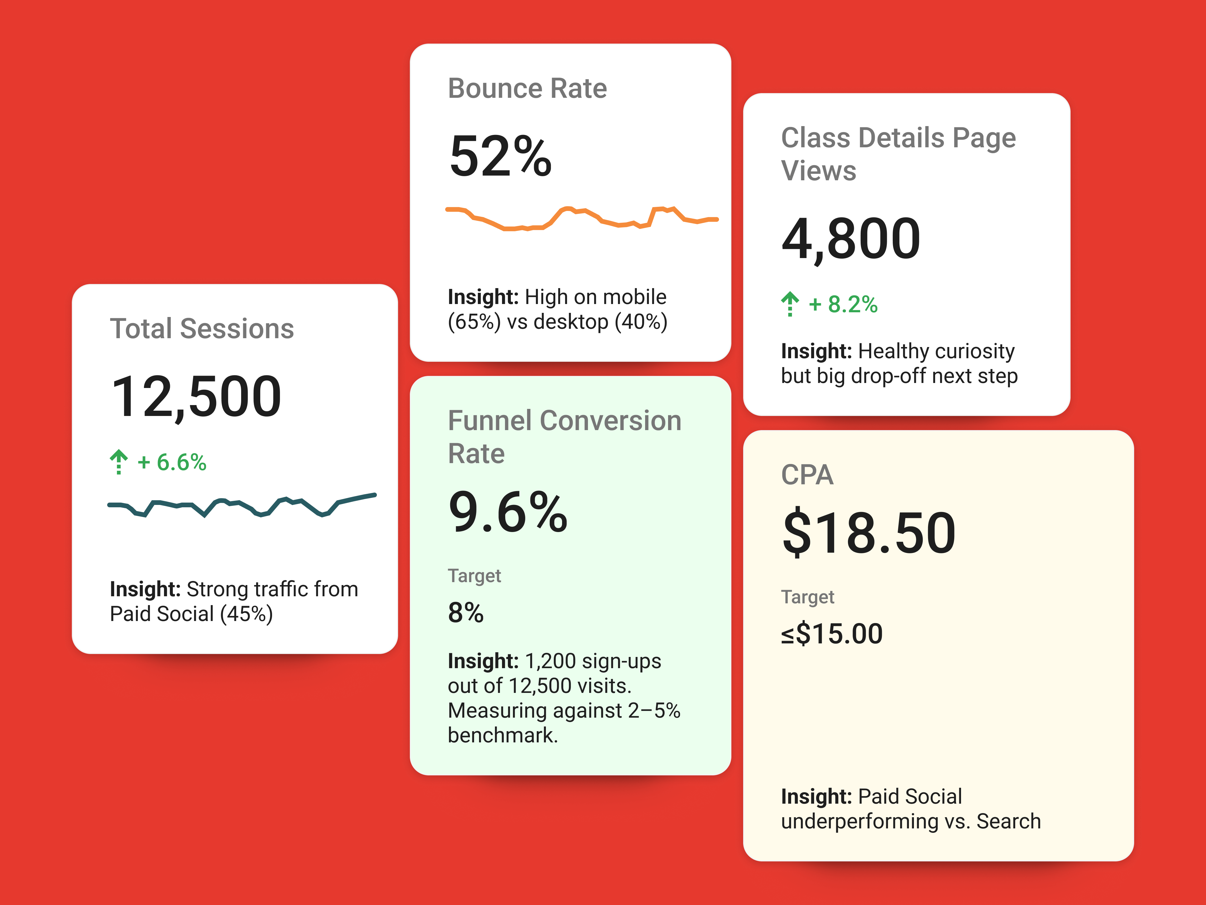
2. KPI Overview Sheet
Modeled baseline data for a 30-day period:
3. Insights & Recommendations
- 📉 Funnel Drop-Off at Class Detail Pages
- 40% of users abandoned after viewing details.
- ✅ Recommendation: Improve landing pages with testimonials, chef bios, and simplified CTAs.
- 💸 Paid Social Traffic Not Converting
- Social Ads = 45% of traffic but <10% of conversions.
- ✅ Recommendation: Shift budget to Google Search Ads & retargeting campaigns.
- 📱 Mobile Underperformance
- Mobile bounce rate (65%) significantly higher than desktop (40%).
- ✅ Recommendation: Optimize mobile UX: faster load speed, shorter sign-up form.
📊 Results
Modeled outcomes assuming optimizations were implemented.
- 🚀 +20% increase in conversions after landing page & funnel fixes
- -15% bounce rate on mobile after UX optimization
- 💰 +25% ROAS improvement after reallocating ad budget to high-intent channels
🧠 What I Learned
- Dashboards are only step one. The real value is connecting metrics to business decisions.
- Funnel visualization reveals hidden leaks. Class detail pages became the main optimization point.
- Mobile-first thinking is essential. Even for niche platforms like cooking classes, most users arrive on their phone.
- Data storytelling matters. Presenting insights visually helped stakeholders understand priorities quickly.